Fiber Goodies Weekend Continues...
Not only did I score a Phat Fiber Fluff box yesterday, but my Knit Picks order arrived in the mail! :) Let me show you what was in the box...
Here is a skein of Knit Picks Bare 100% Peruvian Highland wool. I'm going to make mini-skeins out of it, dye them different colors, and use them for my Beekeeper's Quilt! :)
Next, we have some Knit Picks Dishie multi 100% cotton yarn. This is going to be knitted into a gift that I'll write about later. Don't want to spoil. ;)
Some lovely Shine Worsted in Crocus colorway. 60% Pima Cotton, 40% Modal. Also to be knitted into a gift.
Here is Knit Picks Stroll Fingering weight called "Diving Board Multi." This colorway is not what I expected when I looked on Knit Picks. Knit Picks shows this picture for the colorway.
Looks more on the bluish side to my eyes. But in reality, it's more on the greenish-blue side and brighter than the Knit Picks picture shows.
It is so hard to get it to photograph correctly, even playing with all the manual settings on my camera and using an Ott light. But it is definitely more greenish-blue than blue. At first, I was disappointed that it wasn't closer to what Knit Picks shows on their site, but I think it will make some cute hexipuffs for my quilt.
Remember I wrote about the Color Affection Shawl I want to make? Here's a reminder pic of what it looks like.
I now have the yarns I'll use for it! Again, the colors shown on Knit Picks were not accurate to real life, but I'm OK with it. I've been trying for 2 days now to get the most accurate photos of this yarn to show you what they really look like, but even I'm having trouble.
To the left, is a pic from Knit Picks showing their Pacific Tonal Color. It looks like deep blues, right? Not so much in real life. It has more of a teal quality to it, which I love, but makes it really hard to photograph for some reason. The closest I could get to accurate is the picture on the right.
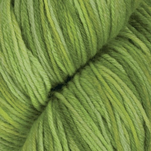
More differences between what you see on Knit Picks, and how they look in real life. Above, you see the Springtime Tonal colorway. On the left, is the picture you find on Knit Picks. On the right, is what the yarn actually looks like. It is VERY bright compared to what you see online. I wish it was a bit more like the Knit Picks picture, but it's growing on me.
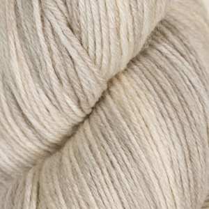
The picture above left is from Knit Picks, and it is ACTUALLY QUITE ACCURATE when you look at the picture I took on the right of the yarn. I think the 3 colors together are going to make a beautiful shawl for Spring.
This morning, Oreo decided that if he couldn't play with my fiber goodness, then he was going to at least take advantage of the Knit Picks box. He had a great time playing! So much so that he had to take a belly-up nap.


No comments:
Post a Comment